

Yesterday, I told you about the Files file management app for Windows 10 and showed you how to download and install this free app. (Click here to read that tip.)
Today, we’ll explore all its features. Let’s start by comparing the icon with that of Windows’ built-in File Explorer. They look pretty similar. However, the file holder on the Files app is at an angle.
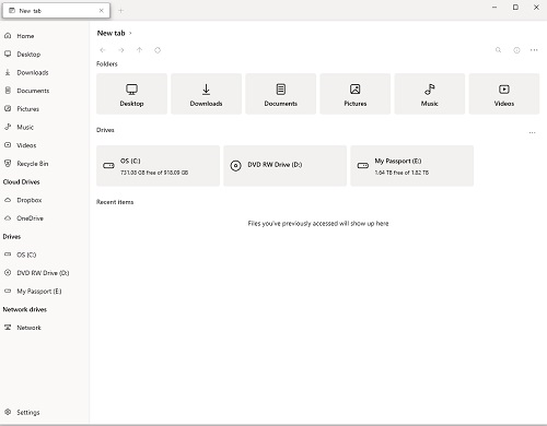
Once it’s open, you’ll notice the real difference. Files uses what is called fluent design. It’s a very simple layout with low contrast between text and background.
Compare that to standard File Explorer. While the right pane looks somewhat similar, the real difference is found in the center pane.

Files puts your Libraries and Drives front and center with large tiles. You also have the ability to add tabs, much the same way you can with a browser.

To add a new tab click the three-dot icon at the right and choose New tab or…

… click the + sign next to an open tab.

Just click on what you want to view in the tabs on the dashboard.

Just click the tab to view the contents of the folder.

When you click on a file in the side pane, it opens similarly to file explorer. Though, you’ll notice the look is less-cluttered. There are no file trees in this app.

Give it a look and let me know what you think.