
It’s time to say goodbye to the Calibri font as the default Microsoft and they want you to help pick the replacement. Calibri has been the default font for Microsoft systems since 2007, when it replaced Times New Roman.

(A default font just means that the the type style is assigned by the manufacturer. Most things on Windows display in Calibri unless you change those settings. For example, when you start a Word document, the default font is Calibri.)
Microsoft says it wants your help to decide which font to replace Calibri with. The company commissioned designers to create 5 new custom fonts. Let’s take a look at them:
TENORITE by Erin McLaughlin and Wei Huang

Microsoft says, “Tenorite has the overall look of a traditional workhorse sans serif (a font without a serif, or a stroke at the ends, like Times New Roman), but with a warmer, more friendly style. Elements such as large dots, accents, and punctuation make Tenorite comfortable to read at small sizes onscreen, and crisp-looking shapes and wide characters create a generally open feeling.”
BIERSTADT by Steve Matteson
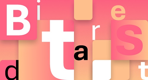
Microsoft describes Bierstadt as “Bierstadt is a precise, contemporary sans serif typeface inspired by mid-20th-century Swiss typography. A versatile typeface that expresses simplicity and rationality in a highly readable form, Bierstadt is also notably clear-cut with stroke endings that emphasize order and restraint.”
SKEENA by John Hudson and Paul Hanslow

According to Microsoft, “Skeena is a “humanist” sans serif based on the shapes of traditional serif text typefaces. Its strokes are modulated, with a noticeable contrast between thick and thin and a distinctive slice applied to the ends of many of the strokes. Skeena is ideal for body text in long documents, as well as in shorter passages often found in presentations, brochures, tables, and reports.”
SEAFORD by Tobias Frere-Jones, Nina Stössinger, and Fred Shallcrass

Microsoft calls Seaford “a sans serif typeface that is rooted in the design of old-style serif text typefaces and evokes their comfortable familiarity. Its gently organic and asymmetric forms help reading by emphasizing the differences between letters, thus creating more recognizable word shapes.”
GRANDVIEW by Aaron Bell

MS says Grandview is “a sans serif typeface derived from classic German road and railway signage, which was designed to be legible at a distance and under poor conditions. Grandview is designed for use in body text but retains the same qualities of high legibility, with subtle adjustments made for long-form reading.”
Microsoft will evaluate the fonts over the next five months based on user response. They’ve made the fonts available to Microsoft 365 users. The company wants users to comment on social media to let them know what the like best.
What do you think? Let me know in the comments.
Not much difference, might as well just leave it like it is.
I think I prefer Skeena of the choices. It looks “modern” to me.
Prefer tenorite because: Elements such as large dots, accents, and punctuation make Tenorite comfortable to read at small sizes onscreen, and crisp-looking shapes and wide characters create a generally open feeling.”
and skeena because: Skeena is ideal for body text in long documents, as well as in shorter passages often found in presentations, brochures, tables, and reports.”
I do a lot of document reading and think these would be easier on my eyes. I’d want to try all of them. I wasn’t a fan of calibri.
( How did the square enter my comment?)
Times New Roman is the only way to go for default. That’s what publishers request when you submit a manuscript. Why fight it?